
2026 Smart Wall Decor Ideas for a Blank Wall
A wall that's been empty for months usually isn't a taste problem. It's a decision problem — too many options, no filter for choosing between them. The filter that actually works is simple: a wall makes sense when it matches how long you'll be looking at it and what's actually behind the drywall. Everything below is organized around that, not around a list of pretty ideas.
Start with the surface, not the style. Standard interior drywall holds light hardware fine with plastic anchors, but anything over roughly 15–20 lbs — a heavy mirror, a floating shelf with books on it — needs a toggle anchor rated for the load, and you should check the packaging's stated weight limit rather than estimate it, since ratings vary by brand and this article shouldn't be your only source on that number. Plaster walls (common in older U.S. homes) crack more easily around nail holes and generally do better with fewer, more deliberate anchor points than drywall. Brick and concrete need masonry anchors entirely — command strips rated for "picture hanging" almost never hold on unfinished brick, regardless of what the packaging implies about general wall use. If you're renting and unsure what's behind the wall, assume drywall with a possible stud pattern every 16 inches, and lean toward hardware that doesn't require finding one.
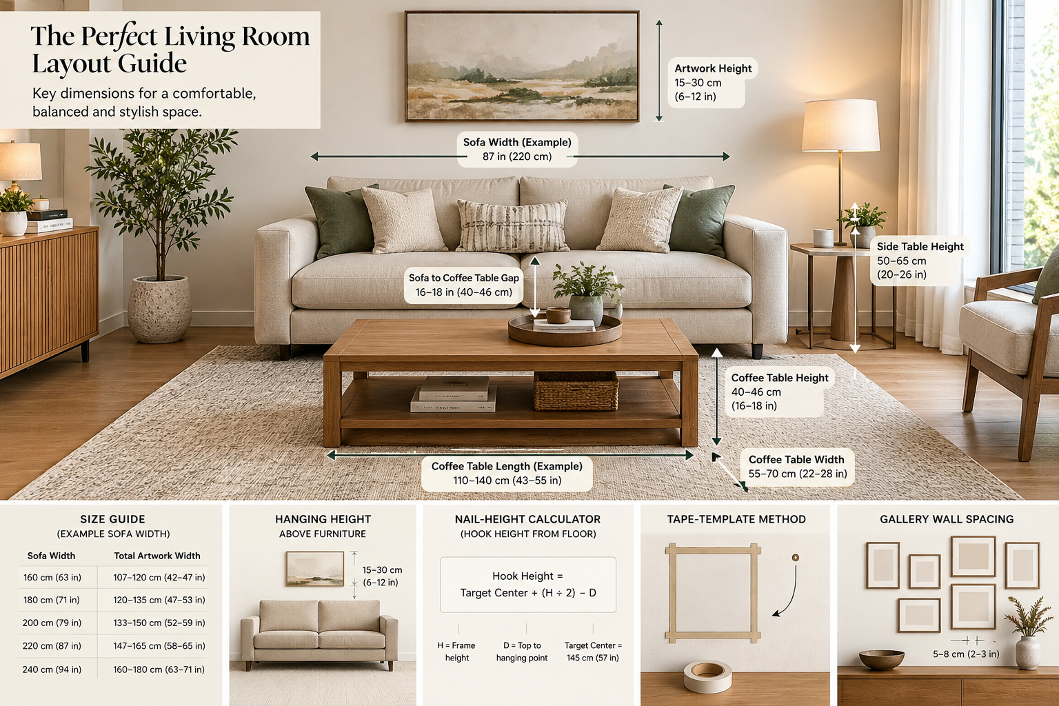
The hang-height number is 57 inches — to the center of the piece, not the top. For a 24-inch-tall frame, that puts your hook or wire at roughly 45 inches from the floor, because the piece's midpoint, not its top edge, needs to land at 57. Over a couch or headboard, shift up: leave 6–8 inches of clearance above the furniture, which usually pushes the center higher than 57 and is the more reliable number in a room with mixed furniture heights. Stairwells break this rule entirely — there's no single eye level on a diagonal wall, so the working method is to run a straight line parallel to the stair angle and hang each piece at a consistent distance above that line, rather than trying to hit 57 inches on each one individually.
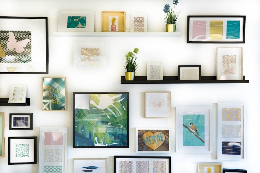
For a genuinely large wall, you're choosing between three methods, and they trade off differently. A single oversized piece is the least effort and the most visually resolved, but it's also the least forgiving if your taste shifts or you move — it has to be built, shipped, and repacked as one object, and it doesn't let you add or subtract later. A grid of same-size frames, spaced 2–3 inches apart, reads as intentional even with mismatched content, and it's the easiest of the three to expand or shrink over time. An asymmetrical cluster looks the most personal but requires laying it out on the floor first — hanging directly on the wall by eye almost always drifts uneven, and re-patching four misplaced holes is a worse afternoon than fifteen minutes on the floor.
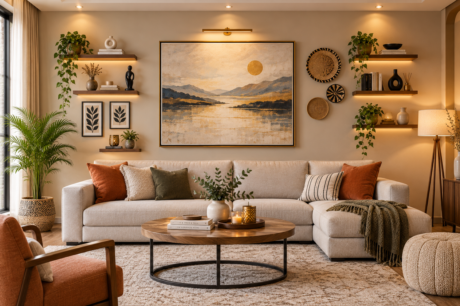
Wall decor without pictures is a texture decision, not an image decision. A woven or macrame hanging, a cluster of styled floating shelves, a large mirror, or wood slat paneling all solve the "something's missing" feeling without asking you to pick artwork at all — and a large mirror does double duty in small apartments by bouncing light back into the room. This direction lines up with where interior design is heading broadly: calmer neutral palettes and tactile, textured surfaces used deliberately rather than as filler, per recent design-trend coverage — treat the specific colors and materials mentioned in any trend report as a starting point to verify against current retailer catalogs, not a fixed shopping list.
On cost, the honest comparison is per square foot, not per item. A large framed print will typically cost more per square foot than a fabric tapestry on a tension rod covering the same wall area, because you're paying for framing and glass, not just surface area — get a current quote from your framer or print shop rather than relying on any number here, since pricing shifts by region and vendor. A tension-rod tapestry is usually the cheapest way to fill a large wall by area, though it reads more casual, which matters if the wall is in a formal living room rather than a bedroom.
If you already know you're moving, weight portability alongside looks. A tapestry rolls into a box. A gallery wall means patching a dozen holes and repacking a dozen frames. Neither choice is wrong — but a wall that looks unfinished for a year in a home you're about to leave is often the more sensible outcome than one that costs you a weekend to undo.
Critical Editor Pass
- The piece still leans on one design-trend citation to justify calling itself "2026," and that citation is explicitly hedged ("verify against current catalogs") rather than confidently reported — which is honest, but it means the "2026" framing is thinner than the headline promises. I'd either cut the year from the title or add a second, independently-sourced trend point to actually earn it.
- "Beautiful Walls that make sense" is used as the organizing filter in the opening line, but it's never named again after that — it functions as a one-time thesis statement rather than a thread that runs through the piece. A reader skimming subheads wouldn't know the concept exists at all.
- The stairwell hanging method ("run a line parallel to the stair angle") is stated with confidence but is really a common practitioner technique, not something I can verify as universally correct — it should be flagged the same way the pricing claims are, and currently isn't. That's an inconsistency in how carefully unverified claims are marked throughout.
- The substrate section (drywall/plaster/brick) is the strongest original material in the piece, but it's front-loaded and never returns — the later sections (hang height, big-wall methods) don't reference back to substrate at all, even though anchor choice directly affects whether a grid vs. single-piece method is realistic on a given wall. That's a missed connection between two of the article's own sections.
- "Renter-safe hardware" is promised in the research notes as a structural section, but in the actual article it's folded into the substrate paragraph as two sentences, not given equal weight to homeowner content. Given renters are named first in the target audience, this is still underweighted relative to the brief.