
Inspiration from Existing Home Elements
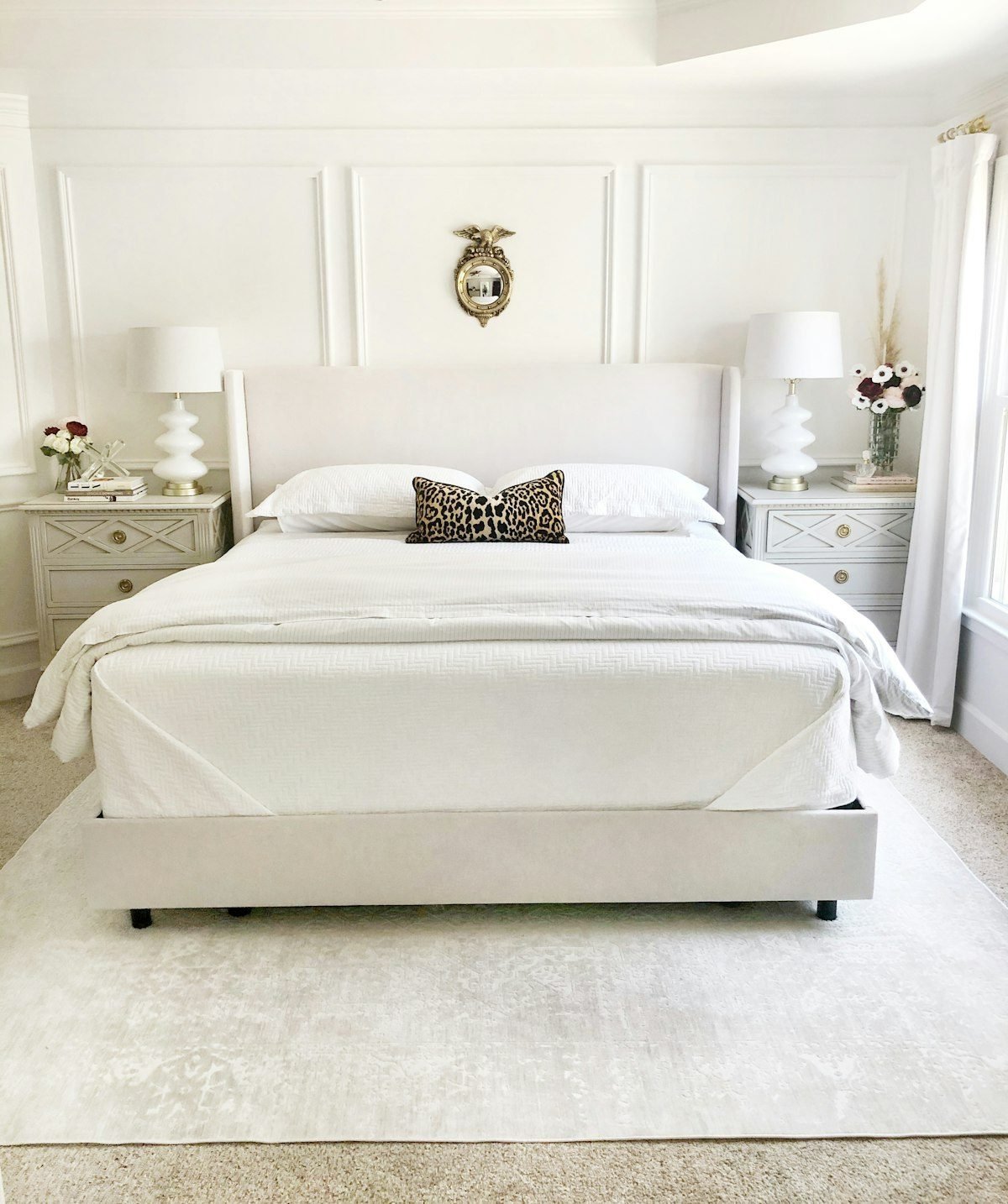
One of the best ways to find inspiration for a new wall hue is to look around your own furnished home and let the existing elements use as guide for your decision. This approach serves as a guide throughout the room. The permanent features such as crown molding, a brick fireplace, or arched window treatments provide strong visual anchors, while architectural features like exposed wood beams or decorative tile can suggest a palette that complements the structure. Take note of the existing finishes on cabinets, art, and other built‑in pieces; their color undertone often hints at shades that will harmonize without clashing. If you have a favorite piece—perhaps a bold painting or a patterned rug—consider how to include in selection a wall color that creates a subtle contrast yet still feels cohesive. When you’ve narrowed the hue, think about the type of paint you’ll apply; a glossy finish can highlight trim like crown molding and add depth to a brick fireplace, while a softer sheen may be better for larger wall expanses.
Impact of Room Size on Color Choice
When considering room size, the overall scale of the area guides whether you lean toward lighter or darker hues. In a small space, bright color lightness can reflect more natural light, creating the illusion of extra room, while deep color darkness may make the walls feel cramped. Conversely, vast rooms can accommodate richer, more saturated tones without overwhelming the eye, and a subtle tone shift can add visual interest without shrinking the perceived dimensions.
For a long narrow room—often described as long narrow—the goal is to make space feel larger and to make ceiling appear higher. Painting the ceiling a light shade that matches or is slightly lighter than the walls reduces the visual distance between floor and roof. Using horizontal stripes or a soft gradient can enhance depth and improve space depth, while keeping the wall color relatively light helps draw the eye outward rather than down the length of the corridor.
The interplay of tone, color lightness, and color darkness also influences the room’s emotional quality. Softer, muted tones tend to foster intimacy, making a bedroom or reading nook feel cozy, whereas high‑contrast, bright tones contribute to an open feel, ideal for living areas where a sense of spaciousness is desired. Selecting hues that align with the intended mood ensures the paint supports both the physical dimensions and the atmosphere you want to create.
Light Sources and Their Effect on Paint Color
When you stand in a room, the natural light streaming through windows can make a hue look bright and warm, while the same wall under incandescent lights may appear softer or even shift toward a yellowish cast. This light source influence creates noticeable color appearance variation, so it’s wise to view in different lighting conditions. Checking the paint at different times of day and night, such as morning, afternoon, and evening, helps you see how the time of day changes the perceived tone.
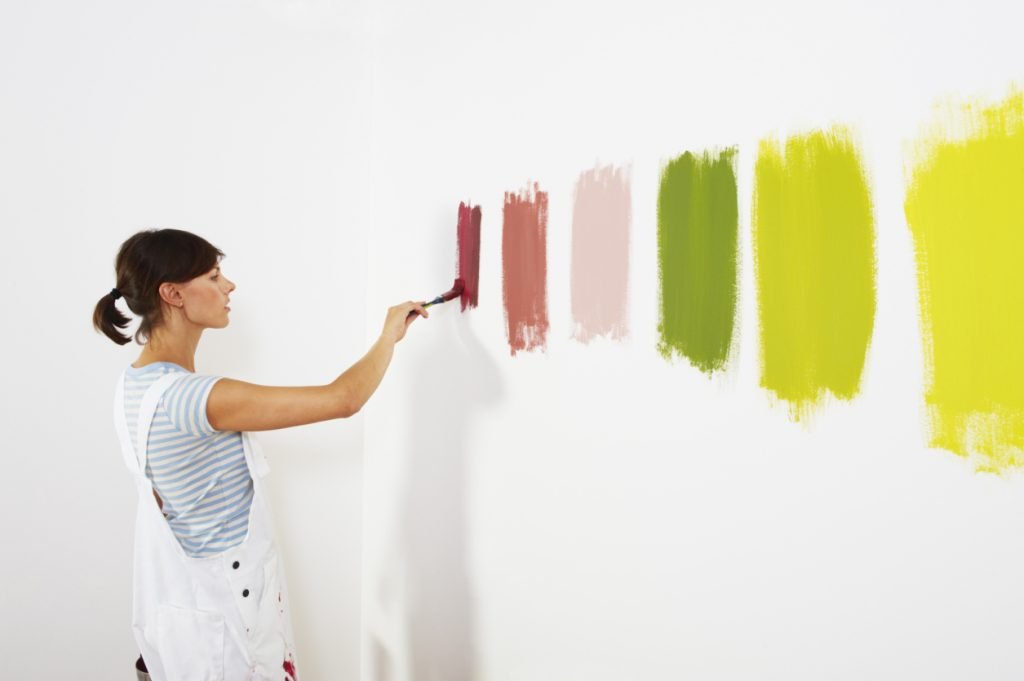
Because color can affect the mood of a space, testing is essential. Grab a paint swatch and place it on the wall, then after a day or two apply a small test swatch in the same spot. Observe how the swatch reacts to the room’s lighting throughout the day to confirm the hue supports the desired atmosphere.
Achieving Cohesive Flow Across Rooms
Creating a sense of flow and coordination is essential for achieving room-to-room cohesion in adjacent rooms. When you choose shades, think of the overall journey from one space to the next and mix and match colors that complement each other without jarring transitions. A reliable palette cleanser is to anchor the scheme with a neutral color—for example, a soft neutral paint or classic white paint on larger walls—while reserving bold hues for accent walls or focal points. Applying use neutral on trim and doors helps tie the spaces together; you can also highlight trim and doors in a subtle neutral paint to keep the visual line smooth. Consulting a professional designer or using predictive tools such as the Colormix Forecast can provide data‑driven suggestions, ensuring the final palette feels unified across the home.
Using Color Psychology to Set Mood
When you think about color psychology, you are really exploring how hue influences mood setting. The warm colors—such as the yellow family and red family—tend to energize a space, creating feelings of optimism or excitement. In contrast, the cool colors—including the blue family and green family—often calm the mind and can make a room feel more spacious. Neutrals serve as a balancing backdrop, allowing the brighter families to shine without overwhelming the senses.
To consider room usage, start by select colors based on function. In social areas like dining rooms, kitchens, and living spaces, you may want the vibrancy of warm colors to encourage conversation and activity, while a touch of cool colors can add visual relief. The social vs private distinction helps you decide whether a bold red family accent wall or a soothing blue family backdrop is appropriate. Even in these lively rooms, sprinkling neutrals on trim or ceilings maintains harmony.
For private settings such as bedrooms, bathrooms, and home offices, the goal is often calm and focus. Here, cool colors like the blue family or green family work well, especially when paired with soft neutrals to avoid distraction. A muted yellow family accent can add a gentle lift without breaking the tranquil atmosphere. By aligning the palette with the intended use, you create a space that supports rest, rejuvenation, or concentration.
Digital & AI Tools for Color Selection
In a modern digital experience, AI-driven platforms use machine learning to turn a simple photo of your room into a palette‑building tool. By clicking upload photo or using the photo upload feature, the system analyses colors and suggests complementary shade, tint, and tone options, helping you find best shade for your walls. The interface offers AI assistance and an immersive AI experience, where you can ask questions and receive real‑time question answering that delivers personalized guidance and expert advice. Beyond immediate selection, the tool captures your preferences as inspiration for future rooms, making it easy to apply the same logic to your next project.